These are 8 different gifs showing the best moments of our music video, these where chosen by the editing involved, how effective it is and how much impact is has on the video itself:
1) This was one our best clips due to the way in which the continuity editing makes changing location and scene very effective. This is done by having the artist cover the camera with her hand and then remove it in a different location. We used this as a transition because it is more creative than just a straight cut to the next shot, which is a technique we used throughout the video.
2) This is medium shot which can be seen int he chorus of the song. Editing is used in this clip to make the artist look like she is going "insane" which can also be seen through the costume, make up and scenery which contrasts how she is seen in the beginning of the video.
3) A reverse shot is used at the start of this clip which suggests she is reverting back to her "normal" self because in the next shot she can be seen looking similar to how she did at the beginning of the video. Although, the editing that can be seen (flashes of black) may suggest that although she seems "normal", her dark/crazy self may not be far.
4) This gif shows the contrast between the two personalities conveyed throughout the music video. This difference in personality is made even more clear as it fades from one personality, where she is "normal", to the chorus when she acts and looks "insane".
5) This clip has elements to it which are more mysterious thus reiterating the consistent change in personality throughout the music video. This is due to the editing as it makes the viewer believe the artist is in two places at once. However, we know this was done by cutting the clip after she lifts the camera up, moving to the center of the path and then re-filming the shot, thus making it seem as if she is in two places at once.
6) This clip consists of a series of short shots, each in a different location, with different costumes and make up in each shot. This clearly demonstrates our artist's colour scheme in terms of her image because although different outfits can be seen, the majority of her outfits are either black or dark colours which highlight the synergy which is present in all of her brand synergy,
Real music videos which influenced parts of our real media products:
We were influenced by this shot in the music video 'Faded' as it demonstrates a good way to change and show different locations in a short time frame through the use of jump shots. We used this idea but developed this to also show a change in our artist by showing personalities throughout the music video.
Faded- Alan Walker
We wanted our video to have a very rural and rundown feel which we wanted to convey through the locations she's in. This would help to both contrast and enhance her two different personalities thus making for a more effective music video. We found two music videos that featured over grown locations and greenery which we drew inspiration from. These were 'No Money' and an unofficial music video for the song 'Sail'.
No Money- Galantis
We were influenced by this shot in particular because it shows the type of close up shots which we wanted to recreate throughout our music video.
This Prezi clearly outlines whether our music video conforms or disagrees with the 6 theories outlined by Andrew Goodwin and the 4 key concepts explored by Carol Vernallis:
Below is an emaze presentation which clearly highlights how our digipak and website uses, develops and challenges conventions of real media products. As well as this it shows what influenced us throughout the process and the clear comparisons between the website and digipak:
Showing posts with label Reflection. Show all posts
Showing posts with label Reflection. Show all posts
Thursday, 26 January 2017

Wednesday, 25 January 2017
Question 2: How effective is the combination of your main product and ancillary texts?
After a year of making our music video and ancillary products, we have filmed, edited, blogged and completed our final task. We are very proud of what we have achieved and we have evaluated our products and the overall experience.
We have been working hard on our music video and ancillary products since September now and we have grown very attached to ensuring it is to a high standard as possible. This presentation helps to show how we have achieved branding consistency and be consistent with Ivory's make-up, image, locations, lighting etc.
Tuesday, 24 January 2017
Question 3: What have you learned from your audience feedback?
During November we finished our first draft of the music video. We showed the video to our peers and media teachers to gain feedback. by doing this it allowed us to know the positives of the video and identify the negatives that needed changing. Below is the feedback we received:
From this feedback we constructed our final digipak, website and music video. The final digipak can be seen below along with out improvements and feedback:
Final Digipak
The yellow dots equal our feedback and the red dots show the response we made to the feedback.

As you can see the final digipak is a major improvement from the first draft. The digipak now has clear synergistic links with the website, video and social media.
We learnt a lot from our continued audience feedback and it was because of this feedback that we were able to perfect out music video and ancillary tasks. Our teacher feedback was helpful but it was our remaining peer feedback and audience feedback (from our target audience) that really aided our group in making final decisions and further improving our cross-media tasks.
By constantly asking and receiving peer and audience feedback we were able to ensure that we were branding our artist in an appropriate which would appeal to our target audience and her fans. By doing this we were ensuring that she fit into her genre of music and that every ancillary task including the digipak and the tour poster tied in with her brand and artist synergy thus making our cross media task more realistic and professional.
Audience feedback was invaluable to us throughout this process as it was essentially at the cornerstone of all our decision making; whether decisions were being made on the narrative of the music video or the pictures to include in our digipak, we were consistently thinking about our feedback and the impact our choices had on our target audience.
From this feedback we constructed our final digipak, website and music video. The final digipak can be seen below along with out improvements and feedback:
Final Digipak
The yellow dots equal our feedback and the red dots show the response we made to the feedback.

As you can see the final digipak is a major improvement from the first draft. The digipak now has clear synergistic links with the website, video and social media.
We learnt a lot from our continued audience feedback and it was because of this feedback that we were able to perfect out music video and ancillary tasks. Our teacher feedback was helpful but it was our remaining peer feedback and audience feedback (from our target audience) that really aided our group in making final decisions and further improving our cross-media tasks.
By constantly asking and receiving peer and audience feedback we were able to ensure that we were branding our artist in an appropriate which would appeal to our target audience and her fans. By doing this we were ensuring that she fit into her genre of music and that every ancillary task including the digipak and the tour poster tied in with her brand and artist synergy thus making our cross media task more realistic and professional.
Audience feedback was invaluable to us throughout this process as it was essentially at the cornerstone of all our decision making; whether decisions were being made on the narrative of the music video or the pictures to include in our digipak, we were consistently thinking about our feedback and the impact our choices had on our target audience.
Question 4: How did you use media technologies in the research, planning, construction and evaluation stages?
Media technologies played an invaluable role in every stage of our music video process. Here is our evaluation of the importance of media technologies in the stages of our project:
Tuesday, 20 December 2016
Website Updates
News Page:

We've added a new story to our news page which links in with our magazine article and front cover. We spoke about Ivory featuring on the cover of the music magazine NME as a part of their ten year anniversary publications.
Home Page:

We've added the album release date to the home page, alongside the release of the single 'Like Me'. This will allow fans to pre-order and prepare for Ivory's album release.
Page Titles:


We've added a new story to our news page which links in with our magazine article and front cover. We spoke about Ivory featuring on the cover of the music magazine NME as a part of their ten year anniversary publications.
Home Page:

We've added the album release date to the home page, alongside the release of the single 'Like Me'. This will allow fans to pre-order and prepare for Ivory's album release.
Page Titles:


To all of the pages we have added social media links so that our fans can constantly access our social media pages and follow our artist.
The buttons link to Ivory's Facebook and Twitter pages and are present on every page of our website.
Music Video Feedback- Jake Wynne
Jake Wynne, a professional music video director, was able to give us feedback on our music videos which was amazing to receive as it helped us finalise our music videos. His criticisms and comments were invaluable to us during the final stages of this process because having someone, who has been successful in this industry, comment on our videos was incredible and a real help with our final feedback.
St. Dizier- Bang Bang: Nice framings, and interesting locations with a refreshingly different grade. However, the edit could have done with some more dynamics though to differentiate the build of the track.
Final Heidi- A good energy to the edit and a great use of the photographic technique which resolves nicely at the end of the video. Heidi's performance was consistently strong and her lip-sync was also good. It would have been nice to see a bit more this lip-sync through the video.
Love Now- Final draft: A great set up and concept with the first person perspective. Some really good locations with amazing colours and vistas. Some more dynamics from the editing would have helped to drive this video along and give a better build to the day ending. It would have been nice to see a bit more of the lip-sync through the video.
Hypnotic Final Video- Really good use of the varying visual dynamics through different parts of the song. The edit picked out the changes in the music very well and the lip-syncing was especially strong. Good use of locations to give variety.
Rolling with Elephants- Great lip-sync, really tight with the editing and I really enjoyed the painted on digital effects. They worked especially well as outlines on the main performance.
I Don't Mind- Tori Lorente: A good filmic aesthetic to the video, with a nice use of colour. Some great framings and solid lip-sync throughout. A little more variety in the edit would have helped it build a bit more towards the end.
Final Video- Megan Thomas: A strong narrative thread that was well performed and consistent. The lip-syncing was very good and the emotion was conveyed very well. A good balance between the narrative and the lip-sync performance, with the cross cutting of both working well.
Ava Final Draft: Good use of varied locations and a strong narrative thread running through. Great lip-sync and a good balance between narrative and performance elements, resulting in a satisfying resolution.
Iuris- Something More: Innovative use of grading, and clever transition technique between shots. Strong lip-sync and some really interesting framing on the performance moments.
Ivory Final- Good strong editing, with clear definitions between verse and chorus. Interesting compositions and a clear filmic aesthetic. The lip-sync was especially good with a clear emotional drive and areas of light and shade.
Avenue- Monday Morning (Final): A really clear beginning, middle and end. A well thought out video with endearing performances from the band with great lip-sync and fun energy. The comedy was well balanced and the view continued to develop as new scenes played out, helping to drive the story through.
Stay Draft 2: Once again, a lovely filmic aesthetic here, with very well composed shots pulling as much out of the environments as possible. The performances were well lip-synced, but at times I felt the emotions were not as clearly signposted.
St. Dizier- Bang Bang: Nice framings, and interesting locations with a refreshingly different grade. However, the edit could have done with some more dynamics though to differentiate the build of the track.
Final Heidi- A good energy to the edit and a great use of the photographic technique which resolves nicely at the end of the video. Heidi's performance was consistently strong and her lip-sync was also good. It would have been nice to see a bit more this lip-sync through the video.
Love Now- Final draft: A great set up and concept with the first person perspective. Some really good locations with amazing colours and vistas. Some more dynamics from the editing would have helped to drive this video along and give a better build to the day ending. It would have been nice to see a bit more of the lip-sync through the video.
Hypnotic Final Video- Really good use of the varying visual dynamics through different parts of the song. The edit picked out the changes in the music very well and the lip-syncing was especially strong. Good use of locations to give variety.
Rolling with Elephants- Great lip-sync, really tight with the editing and I really enjoyed the painted on digital effects. They worked especially well as outlines on the main performance.
I Don't Mind- Tori Lorente: A good filmic aesthetic to the video, with a nice use of colour. Some great framings and solid lip-sync throughout. A little more variety in the edit would have helped it build a bit more towards the end.
Final Video- Megan Thomas: A strong narrative thread that was well performed and consistent. The lip-syncing was very good and the emotion was conveyed very well. A good balance between the narrative and the lip-sync performance, with the cross cutting of both working well.
Ava Final Draft: Good use of varied locations and a strong narrative thread running through. Great lip-sync and a good balance between narrative and performance elements, resulting in a satisfying resolution.
Iuris- Something More: Innovative use of grading, and clever transition technique between shots. Strong lip-sync and some really interesting framing on the performance moments.
Ivory Final- Good strong editing, with clear definitions between verse and chorus. Interesting compositions and a clear filmic aesthetic. The lip-sync was especially good with a clear emotional drive and areas of light and shade.
Avenue- Monday Morning (Final): A really clear beginning, middle and end. A well thought out video with endearing performances from the band with great lip-sync and fun energy. The comedy was well balanced and the view continued to develop as new scenes played out, helping to drive the story through.
Stay Draft 2: Once again, a lovely filmic aesthetic here, with very well composed shots pulling as much out of the environments as possible. The performances were well lip-synced, but at times I felt the emotions were not as clearly signposted.
Digipak Analysis
Here is a detailed analysis of our second digipak draft, which outlines the shot types and why we chose them for our album's digipak:


Filming Locations
Whilst filming we went to several different locations. Here is an evaluation of our third location:
Monday, 5 December 2016
First Draft Feedback
We received lots of feedback from different media groups which was extremely helpful as there was lots we needed to adjust including our merchandise and our digipak.
Key Pieces of Feedback:
Good:
Some nice shots in the music video sneak peek
Our artist's image fits the genre and style of video we are trying to create
Good use of interesting locations which match your image
Good use of different social media platforms including Twitter, Facebook and Instagram
Nice, simple album cover with continuity of image from this to our music video.
Needs Work:
Need to ensure their is continuity across all band products regarding the colour of the logo; must always be the same
Need to change up the framing of the shots to have more diversity
Album digipak needs some work and needs to be completed with less focus on images
The flowery dress that can be seen in the music video sneak peek doesn't really fit in with the other outfits or the artist's image as a whole
When the beat drops at the start of the chorus, the shot needs to clearly indicate this drop and the artist needs to start going crazy
The merchandise is too male-orientated and needs more diversity
In order to appeal to a younger demographic, a non-explicit version of the song needs to be released.
Key Pieces of Feedback:
Good:
Some nice shots in the music video sneak peek
Our artist's image fits the genre and style of video we are trying to create
Good use of interesting locations which match your image
Good use of different social media platforms including Twitter, Facebook and Instagram
Nice, simple album cover with continuity of image from this to our music video.
Needs Work:
Need to ensure their is continuity across all band products regarding the colour of the logo; must always be the same
Need to change up the framing of the shots to have more diversity
Album digipak needs some work and needs to be completed with less focus on images
The flowery dress that can be seen in the music video sneak peek doesn't really fit in with the other outfits or the artist's image as a whole
When the beat drops at the start of the chorus, the shot needs to clearly indicate this drop and the artist needs to start going crazy
The merchandise is too male-orientated and needs more diversity
In order to appeal to a younger demographic, a non-explicit version of the song needs to be released.
Wednesday, 9 November 2016
Halfway Evaluation Feedback
We received lots of feedback from different media groups which was extremely helpful as there was lots we needed to adjust including our merchandise and our digipak.
Key Pieces of Feedback:
Good:
Key Pieces of Feedback:
Good:
- Some nice shots in the music video sneak peek
- Our artist's image fits the genre and style of video we are trying to create
- Good use of interesting locations which match your image
- Good use of different social media platforms including Twitter, Facebook and Instagram
- Nice, simple album cover with continuity of image from this to our music video
- Need to ensure their is continuity across all band products regarding the colour of the logo; must always be the same
- Need to change up the framing of the shots to have more diversity
- Album digipak needs some work and needs to be completed with less focus on images
- The flowery dress that can be seen in the music video sneak peek doesn't really fit in with the other outfits or the artist's image as a whole
- When the beat drops at the start of the chorus, the shot needs to clearly indicate this drop and the artist needs to start going crazy
- The merchandise is too male-orientated and needs more diversity
- In order to appeal to a younger demographic, a non-explicit version of the song needs to be released
Tuesday, 8 November 2016
Halfway Evaluation and Feedback
Today we presented our halfway evaluation to our class and received their feedback on every element of our artist brand so far including the website, the name, the digipak, the merchandise and the music video itself.
Here is our halfway evaluation presentation:
Here is our halfway evaluation presentation:
Merchandise Updates and Website
One key piece of feedback that we received from our halfway evaluation was that our merchandise was too manly and wasn't very exciting. We really took this on board and quickly rectified the issue.

 These are our original merchandise pieces which we were told were too male-orientated. The original pieces include tops, jumpers, and caps.
We took this feedback on board and made our merchandise more unisex. Our new pieces include a more diverse range of merchandise including tops, hoodies, posters, bags, caps and specific tour merchandise.
Furthermore, we have created a separate merchandise website which links to our original website so that fans can easily access Ivory's merchandise from her website homepage. This is an idea which we derived from information collected from our similar artist website research.
Here is our merchandise website which features all of our current merchandise pieces with different pieces being added regularly.
http://saraholivier1.wixsite.com/ivorymerchandise
As you can see when you venture onto our official website, there is a active link to the 'Merch Store' which takes you directly to our merchandise website.
http://saraholivier1.wixsite.com/ivoryofficial
One thing we considered extensively when making our merchandise website was continuity and synergy across band products. This was because during our halfway evaluation we received the feedback that our artist's image and colours were not presented consistently across all of our products including the website, the original merchandise and the video itself.
This is why we chose a neutral, professional colour scheme for our merchandise website; ensuring to incorporate the colours which feature throughout our website, digipak and artist's logo.
 Colours such as white and light blue with black writing can be seen throughout our merchandise website.


We took this feedback on board and made our merchandise more unisex. Our new pieces include a more diverse range of merchandise including tops, hoodies, posters, bags, caps and specific tour merchandise.

Furthermore, we have created a separate merchandise website which links to our original website so that fans can easily access Ivory's merchandise from her website homepage. This is an idea which we derived from information collected from our similar artist website research.
Here is our merchandise website which features all of our current merchandise pieces with different pieces being added regularly.
http://saraholivier1.wixsite.com/ivorymerchandise
As you can see when you venture onto our official website, there is a active link to the 'Merch Store' which takes you directly to our merchandise website.
http://saraholivier1.wixsite.com/ivoryofficial
One thing we considered extensively when making our merchandise website was continuity and synergy across band products. This was because during our halfway evaluation we received the feedback that our artist's image and colours were not presented consistently across all of our products including the website, the original merchandise and the video itself.
This is why we chose a neutral, professional colour scheme for our merchandise website; ensuring to incorporate the colours which feature throughout our website, digipak and artist's logo.

Monday, 7 November 2016
Further Website Research
When designing our website we studied and researched other solo female artist's websites to see what key features are present in all of their websites.
The three main artist's websites that we consistently drew inspiration from were: Lady Gaga's, Lorde's and Ellie Goulding's.
Key Features:

Lorde

Ellie Goulding

The three main artist's websites that we consistently drew inspiration from were: Lady Gaga's, Lorde's and Ellie Goulding's.
Key Features:
- The artist's picture/image is the first thing you see on the website and is usually the home page background.
- All of the websites are very minimalistic and simplistic which works well with the artist's image.
- All promote the artist's current album or single on the home page.
Lady Gaga

Lorde

Ellie Goulding

Monday, 31 October 2016
Danbury Filming Reflection
Over the past couple of weeks we have visited this location in Danbury multiple time to get as many quality shots as possible. This location is perfect because it has a more industrial feel to it with the abandoned greenhouses and warehouses, but also has a more nature orientated side to it. With lots of beautiful apple trees, plenty of land and nature footpaths; this was the perfect location. Whilst we were at this location we got lots of great footage that we can use throughout our music video.

 At this location we had planned many different shots but when we arrived at this location for the first time we realised that some of our shot ideas were not feasible due to health and safety reasons.
However, despite this setback we got some great improvised shots which were really fun to film.
We did not expect the location to be as picturesque as it turned out to be which was really helpful for the more scenic elements to our video but we then had to create some more gritty shots, using the darker elements of the location, for the rest of the music video.
What went wrong at this location:
We had to go filming at this location multiple times and so due to poor weather, the lighting often differed across the footage which made some of the footage unusable.
We struggled to film all of the shots we wanted because of health and safety concerns with the low ceilings and fragile greenhouses.

 At this location we had planned many different shots but when we arrived at this location for the first time we realised that some of our shot ideas were not feasible due to health and safety reasons.
However, despite this setback we got some great improvised shots which were really fun to film.
We did not expect the location to be as picturesque as it turned out to be which was really helpful for the more scenic elements to our video but we then had to create some more gritty shots, using the darker elements of the location, for the rest of the music video.
What went wrong at this location:
We had to go filming at this location multiple times and so due to poor weather, the lighting often differed across the footage which made some of the footage unusable.
We struggled to film all of the shots we wanted because of health and safety concerns with the low ceilings and fragile greenhouses.
Feedback on Album Cover

Album Cover

Back Cover
Teacher- Miss Brookes:
I really like the font as it is clear and simple to read.
The image is really nice and works with the artist image you have created.
Improve:
Try warming the image up slightly, so that it matches the rest of the colours in your digipak.
Classmates:
Georgia:
Album Cover: The font really suits the cover and the photo is good.
Back Cover: The consistency of the fonts across the two photos really works.
Saturday, 29 October 2016
Feedback on Editing
After we started to edit our music video and it started to come together, we thought it would be a good idea to ask for feedback on our editing to see what we did well and what we could improve. Below is the feedback that we received:
What We Did Well:
What We Did Well:
- The footage is very clear and the colour of the footage from the different locations match perfectly. Meaning that the footage works well together and looks professional.
- A couple of the fast cut shots match perfectly with the chorus of the song and therefore look really good within the music video.
What Could Have Been Improved:
- The locations we chose have very different themes and so when edited together they look strange. To improve this we had the idea of putting the more calm/innocent footage at the beginning of the music video and the crazy footage towards the end to show the development of her image. This would help the footage make sense to the audience.
- Another improvement that could be made to the editing of our music video is the special effects. We need to include more exciting and quirky effects that will fit in with creepy image we are trying to portray for our artist.
- We also need to work on the lip sync to ensure that the timing of the song with the footage of the artist singing is perfectly in sync so it is believable to the audience.
Tuesday, 25 October 2016
Website: Early Stages
The website of an artist is extremely important as it is a universal platform that allows the artist to connect with their fans and vice versa.
We have begun designing the website for our artist Ivory and are slowly getting to grips with the perfect layout and content in order to accurately represent our artist.
Here is our website so far:
Improvements to made:
We have begun designing the website for our artist Ivory and are slowly getting to grips with the perfect layout and content in order to accurately represent our artist.
Here is our website so far:
Improvements to made:
- Once our music video is complete we must upload it to the website
- When we have completed the "Making of Gasoline" video it must be uploaded also
- Tour dates are to be added
- We must complete and update our biography paragraphs
- Complete our gallery page
- Create an Instagram link
- Create a unique fan page
- Add a merchandise page
- Create a press release for the new album
- Finalise changes and layout
- Receive feedback and make further improvements
Reflection of Southend filming
Today we visited Leigh-On-Sea and Hadleigh castle to do some extra filming for our music video. Whilst we were there we got a lot of great footage but we did make a few filming mistakes.
Great Improvised Shots:
Because we went filming with no real idea as to what shots we wanted to get it opened us up to some amazing, improvised filming possibilities which was really exciting and fun for everyone.
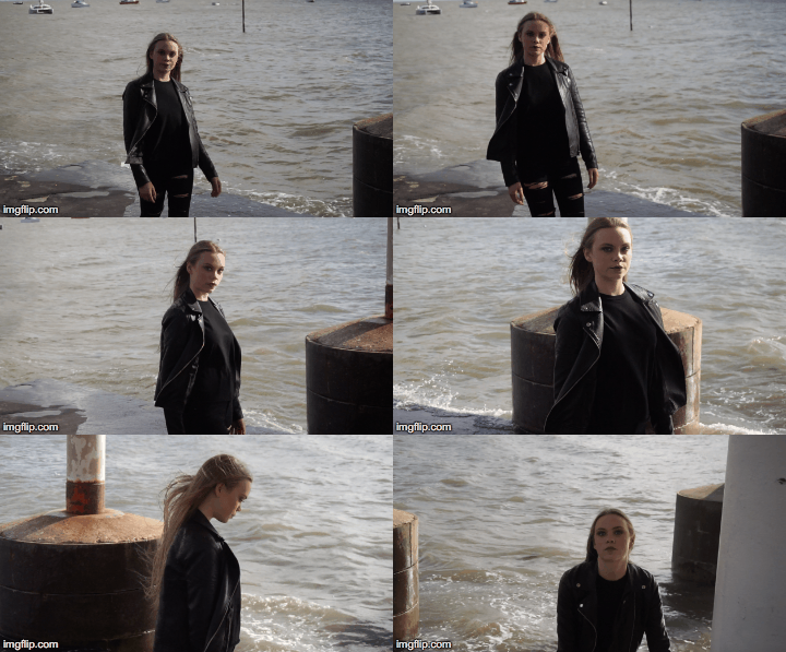
Shots like this one were purely improvised after we saw the water and the pylons under the bridge whilst walking past. Once we had an idea of what we would do we set up and started filming. The result was a visually stunning tracking shot of the artist walking through the water which serves as a great way to the start the music video.
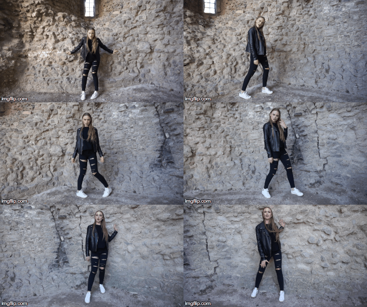
Another example of fun and improvised filming was our trip to Hadleigh Castle. We went to Southend to film in Leigh on Sea and expected to stay filming there for the entire time we were out but after seeing a map that featured the castle we decided to take a trip down there in the hope that we would get some cool shots; and we did.
The castle and the land were amazing and provided many different shot ideas and camera angles, like this circular tracking shot we filmed inside the castle ruins itself.
What went wrong:
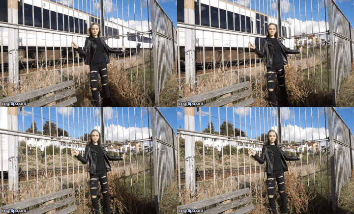
This was a shot idea that came out of nowhere and was completely improvised in the moment. Two members of our group saw that the train was about to pass and rushed us to set up and film our artist in front of the passing train.
It would have been a great shot if it wasn't for a few silly mistakes. As you can see from the shot below, we accidentally got shadows in the shot which distracts the audience away from the artist thus ruining the shot.
Secondly, because we rushed setting up and didn't have time to focus before the train passed, our artist can be seen smiling and laughing before going into character but at that point the shot was almost over and the train had almost completely passed.
Great Improvised Shots:
Because we went filming with no real idea as to what shots we wanted to get it opened us up to some amazing, improvised filming possibilities which was really exciting and fun for everyone.
Shots like this one were purely improvised after we saw the water and the pylons under the bridge whilst walking past. Once we had an idea of what we would do we set up and started filming. The result was a visually stunning tracking shot of the artist walking through the water which serves as a great way to the start the music video.
Another example of fun and improvised filming was our trip to Hadleigh Castle. We went to Southend to film in Leigh on Sea and expected to stay filming there for the entire time we were out but after seeing a map that featured the castle we decided to take a trip down there in the hope that we would get some cool shots; and we did.
The castle and the land were amazing and provided many different shot ideas and camera angles, like this circular tracking shot we filmed inside the castle ruins itself.
What went wrong:
This was a shot idea that came out of nowhere and was completely improvised in the moment. Two members of our group saw that the train was about to pass and rushed us to set up and film our artist in front of the passing train.
It would have been a great shot if it wasn't for a few silly mistakes. As you can see from the shot below, we accidentally got shadows in the shot which distracts the audience away from the artist thus ruining the shot.
Secondly, because we rushed setting up and didn't have time to focus before the train passed, our artist can be seen smiling and laughing before going into character but at that point the shot was almost over and the train had almost completely passed.
Subscribe to:
Posts (Atom)